Editor’s note: This story has been updated with correcting a name misspelling.
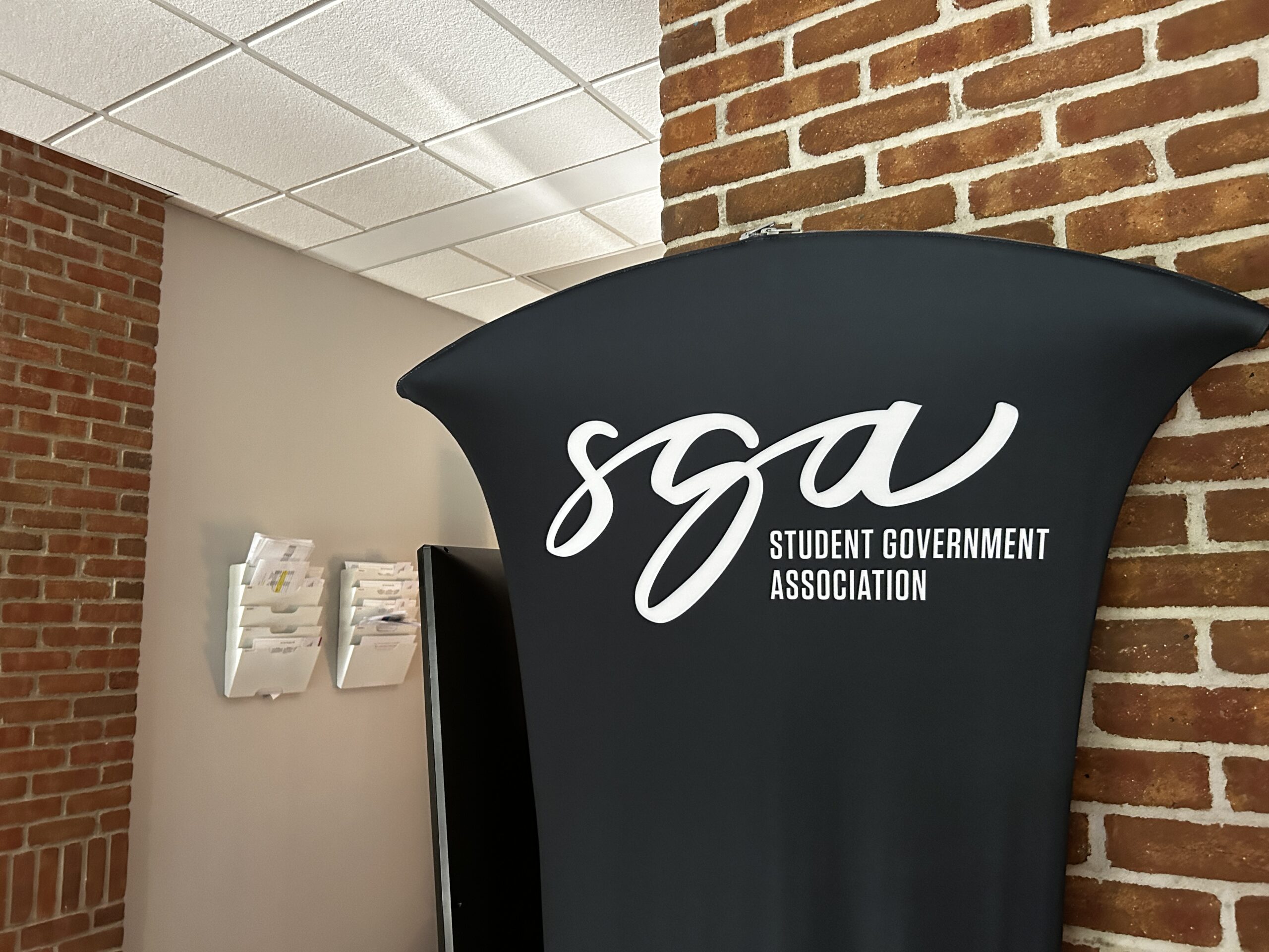
As the fall semester gets under way, SGA releases their new logo to go along with IWU’s brand.
Jonny Rupp, the associate dean of student involvement, said that the logo change came after many different changes to previous logos.
“In the past, there’s been many iterations of the logo,” Rupp said. “We just wanted to stop changing it and wanted something that was university brand compliant.”
Rupp said that he reached out to the marketing department first when he learned about the rebranding changes that began last spring.
“I reached out first, but only because I knew they were doing a redesign or rebranding, and I just want to get in front of it,” Rupp said.
Jason Steiner, executive director of brand and creative, said that the rebranding changes come from the need to maintain brand compliance.
“I’ve been in this role for about a year, and honestly that was one of the reasons I was brought on,” Steiner said. “We wanted to strengthen and solidify our brand image and our brand creative, just to create a little more consistency across the board, across the university, and in all areas of our marketing and advertising and creative material.”
Steiner said that he has been working in the branding and creative business for 20 to 30 years and has seen how successful branding is for businesses.
“(Branding) is what every successful organization, company, and university does,” Steiner said. “Branding is a promise to your customers, your students, and the people you work with.”
As SGA worked on redesigning their logo, Rupp said that the marketing department was extremely helpful throughout the process.
“The marketing department was very gracious with us and actually worked with us on our design, kind of step by step,” Rupp said.
With the new SGA logo being complete and in full use, Grace Huizingh, the SGA student body president, said that the new logo accomplishes what SGA wanted.

“They were going for youthful but also semi professional, and I think it is a good compromise of both,” Huizingh said. “I love it, and it looks good.”
Huizingh said that she had a little bit of input on the creation of the logo, but not enough due to only being elected last spring.
Kara Simison, the SGA director of communications, said that she also had a little bit of input on the creation of the logo and that it stands out more.
“It is unique and playful and stands out more than previous ones,” Simison said. “It will help with reaching the student body.”


cheapest buy androxal new york city
get androxal price generic
order rifaximin uk online pharmacy
order rifaximin usa overnight delivery
au comptoir kamagra alternative
kamagra commandes en ligne de livraison
enclomiphene comprar peru
usa fhizer enclomiphene
buying flexeril cyclobenzaprine generic in us
online order flexeril cyclobenzaprine buy in the uk
how to buy dutasteride cheap mastercard
cheapest buy dutasteride generic how effective
get gabapentin price from cvs
gabapentin free saturday delivery
how to buy fildena american express canada
buying fildena canada how to buy
buying itraconazole purchase tablets
cheap itraconazole no prescription needed
buy generic staxyn toronto
buying staxyn generic canada
online order avodart generic extended release
buy avodart usa buying
best price for generic xifaxan
how many orgasms can u get on 1 xifaxan pill
kamagra comprar kamagra generico
kamagra bez předpisu kanady